Thursday, April 25, 2019

NHL Uniforms Ranked


As I've grown to like sports more, I've found hockey to be underrated.  It's energetic and fun.  I'm even forming opinions about it outside casual team preferences and uniforms (such as wondering how the hell anyone could watch the Predators' season and come to the conclusion that Rinne was the problem).  Also unlike my football uniform list (which needs some updating), I'm not giving credit for alternative uniforms.  If you have a good uniform, then use it.


31. New York Islanders
I admit I'm a bit biased with color choices, and I do not think blue and orange go particularly well together.  I don't care what you're color wheel says.  I call shenanigans on the whole idea of Complementary Colors.  Even worse, they scrapped a more distinctive uniform with a better logo.


30. Edmonton Oilers
Pretty much same thing as the Islanders except they have a better logo.  The older uniforms are better.


29. Chicago Blackhawks
This gets credit for being one of the earlier red-and-black unis but it doesn't balance the two colors enough to distinguish itself and the logo is basically a crappy version of the Redskins' its earlier logos.


28. Anaheim Ducks
It's understandable that the Ducks would want to distance itself from its movie/cartoon-tie-in past, but I miss the old color palate.  "Mighty Ducks" was also a rather awkward name, but then again that's what happens when you name a team after a cute, benign animal.


27. Arizona Coyotes
In all fairness what would you do when you have a good uniform with a distinctive color scheme, a great logo and local flavor?  Why you relegate that to an alternate and replace it with the most generic thing ever, of course.  That's just common sense.  We're not a nation of madmen, are we?


 26. Carolina Hurricanes
Red-and Black is usually a very good color combination, but it's oddly overused in the NHL.  


25. Tampa Bay Lightning
Generic Blue single color with generic logo.


 24. New York Rangers
It's not without its retro 70's charm, but it's a bit uninspired, and there are many red, white, and blues in this league.


23. Vancouver Canucks
The green-blue scheme is pretty standard.  I like orcas, but I don't particularly care for the logo.


22. Pittsburgh Penguins 
This uniform doesn't do anything the Bruins' uniform doesn't do better.  They should make their alternate standard to at least give it a different color dominance.  Or go back to the old unis.  They should also go back to their old logo, which looks like it was designed by a professional on the subject, rather than a child.  There's a proud tradition of reverting to the "classic" logo even though it sucks and is clearly inferior (see also: Detroit Pistons).


21. Ottawa Senators
Another red-and-black uniform.  NHL is definitely going through an edgelord phase.  I like the logo, though.


20. Montreal Canadiens
The Montreal Chris-Chans.  Ok, seriously, it's an ok retro design.


19. Minnesota Wild
Not the prettiest uniforms, but they get points for boldness. 


18. Washington Capitals
There a few red-white-and-blue uniforms in this league.  The colors are used effectively but the logo is one of those boring, uninspired "sportsball logos;" It's a hockey stick.  And the older/alternate logos are so much better!


17. Toronto Maple Leafs
It's simple, but effective.  And they had it longer than Tampa Bay.


16. Dallas Stars
If its effective green uniforms weren't filling a void, I would downrank this for scrapping a blatantly superior uniform.  


15. Calgary Flames
Effective use of yellow trim makes this one of the better red-and-black uniforms here.


14. Columbus Blue Jackets
You'd think Washington would have the more effectively patriotic uniform, but Ohio goes all out with its stars-and-stripes.


13. Detroit Redwings
I usually hate plain red uniforms, but this is surprisingly rare in the NHL, and the logo is excellent.


12. Florida Panthers
The white stripe punctuated by the effective seal gives this a great look, much like the state flag.


11. St Louis Blues
A surprisingly effective use of colors.


10. Philadelphia Flyers
Effective color scheme with a classic logo.


9. New Jersey Devils
First team to effectively use the red-and-black scheme, and the logo is good.


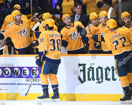
8. Nashville Predators
If they were still using their first uniforms, they'd be ranked rock-bottom on this list.  The weak light gray, blue, and white neutered the uniform, and the yellow trim only complicated it further.  I remember looking at them forcing myself to like them to no avail as a kid.  Fortunately they switched to the always-effective navy-and-yellow scheme.  Yellow dominance balanced with blue gives it an effective two-tone look that distinguishes them from...


7. Buffalo Sabres
But dark blue with yellow trim also looks good, and nicely marshal.  The logo is cool as well.  Buffalo has a tradition of naming their teams something else and then just putting a buffalo on the logo.  Next time they get a team they should just call it the Buffalo Buffaloes.


6. Colorado Avalanche
The color scheme is unique and attractive.


5. Winnepeg Jets
I've always loved navy-and-light blue, and I also love the cel-shaded RCAF symbol with an F-18 on it.


4. LA Kings
You can't go wrong with black if you're the only team in the league doing it.


3. Las Vegas Golden Knights
Dark neutral colors with bright highlights and the best logo in the league.  Golden Knights seem to be a point of pride among the locals.  It's easy to forget that Vegas is a city that people live in, so they're happy it can be known for something other than a gambling destination.  I can relate, as I'm not the biggest fan of country music.  That's still the reason why fans from other Southern teams get off on calling us hicks; heaven only knows what kind of trash-talk Vegas fans endure.


2. Boston Bruins
The effective contrast of black and yellow and the nicely symmetrical logo.


 1. San Jose Sharks
I love teal and black and I love sharks.  Simple as that.

Saturday, April 6, 2019

Not So Boldy Going


Star Trek
2009
D: J.J. Abrams
**********
Pros: Special Effects, Design, Score, Karl Urban
Cons: Forumulaic Plot, Character Derailings, Bland Villain


       I seem to be a bit of a contrarian when it comes to the Star Trek reboots.  I think that this movie and Beyond are damn near unwatchable while finding Into Darkness to quite fun.  I believe this may be due to J.J. Abrams’ being more of a Star Wars fan.  As a result, he made this more of a fast-paced action movie, missing the appeal of the franchise in general.  The Trek franchise has a different appeal, one that involves complex interactions between alien cultures and also monster-of-week stories relying on creative sci-fi concepts.  Star Trek (2009) and Star Trek Beyond both deal with the creative sci-fi concept of bland two-dimensional villains whose motivations make no sense.
      Our villain is Nero (Eric Bana), the Romulan captain of a mining vessel who is quite angry at Spock (Leonard Nimoy) a century into TOS' future because the latter failed to save Romulus from its destruction (a blight on the Prime timeline, btw).  Their respective ships are sucked into a black hole and sent back in time.  Instead of taking advantage of this opportunity to prevent this tragedy in a constructive way, Nero decides that the most rational course of action is to destroy Vulcan out of revenge and decimate the Federation, whose inaction he also blames.  This half-hearted attempt at a sympathetic backstory involves his being a humble working man with a (now dead) pregnant wife.  But that doesn’t matter because his supposed depth never actually plays into the plot; he’s just a monster that needs to be stopped, and that’s that.  Whatever pathos he displays is far outweighed by level of destruction he intends to cause.  This phoned-in attempt at sympathy makes his motivations even more nonsensical than if he was simply a one-dimensional psycho.  It also doesn’t help that he has no charisma or style to even make him entertaining. 
       Nero is an example of a trope in modern genre movies I like to call the Boredom Troll.  One way to spot them is the design: they usually have a bland goblin-like appearance, possibly with an odd bone structure around the eyes that’s supposed to simulate anger but only looks like an odd bone structure around the eyes.  Also, because advances in motion capture have seemed to reduced acting under prosthetics to a lost art, the actor’s performance will be quite bland (even it’s actually a pretty good character actor under there).  Indeed, the Boredom Troll displays little personality or charisma.  There is often a noncommittal attempt at an “understandable” motivation that will be offset by the scope of their villainy, usually involving a gimmicky superweapon that will turn a planet's atmosphere into Spam so that they might make a source of food for their people or something.  Coincidentally the villain from Star Trek Beyond is also a Boredom Troll.
        Like the silk-tongued Mephistopheles he is, Nero’s first action in the revised timeline is to impulsively murder a Starfleet captain and destroy the Federation's whole fleet, but his plans are delayed be the heroic self-sacrifice of  George Kirk (Chris Hemsworth), whose wife (Jennifer Morrison) soon gives birth to James T. Kirk (Christopher Pine).  Fatherless, Kirk has a more troubled childhood, and his own backstory obviously entitles him to a typical heroic arc (the loss of a parent before he could remember helps).  He is encouraged by Captain Christopher Pike (Bruce Greenwood) to enlist in Starfleet and he becomes an officer in no short order.  He becomes the captain of the Enterprise in the course of the movie's plot, absurdly fast.  One thing I like about Star Trek is the emphasis on hard work and patience to be a success rather than a sense of narrative entitlement.  Star Wars is great for polishing off the Monomyth off and making it fresh, but it gets stale when too many stories do it.  Just like the prequels were an unsuccessful attempt to turn Star Wars into Star Trek, Star Trek 2009 is an unsuccessful attempt to do the opposite.  At least the former gets points for creativity.  I like Kirk's being bold but unflappable rather than hotheaded and exaggerated.  A good example of his coming off like a caricature is during the movie's version of the Kobayashi Maru test.  Kirk comes off cartoonishly smug, and it exaggerates the scenario to make Kirk look like a true cheater rather than someone protesting the perceived unfairness of the test by making it possible to beat.
          He butts heads with young Spock (Zachary Quinto), who displays far too much emotion.  We can’t have the impact of Spock’s overjoyed reaction to Kirk’s survival in “Amok Time” when the character’s already beside himself the whole time anyway.  Shipping him with Uhuru (Zoe Saldana) doesn’t exactly help.  The movie takes great pains to spoon-feed us his identity crisis as a half-breed in melodramatic ways.  Because Kirk and Spock’s exaggerated personalities clash so much, the reboot foregoes the compelling Kirk/Spock/McCoy triumvirate.  This is a shame because Karl Urban is easily the best part of the movie, making the role is own in a memorable way that still does justice to the character.
           Scotty (Simon Pegg) is likable enough but he’s paired up with a cute alien (Deep Roy) that evokes a trope that generally adds a degree of separation from the rest ofthe cast.  Despite the degree of caricature present in the movie, an improvement over the source material is that Chekov (the late Anton Yelchin) is less of a joke character.  Other members of the cast include John Cho as Sulu, Ben Cross and Winona Ryder as Spock’s parents, Faran Tahir, Tyler Perry, and James Doohan.  Our heroes eventually fight their way into defeating the villain with such visual splendor I’m sure it’s worth the lack of creative writing.
           The movie’s visuals are a strength.  I love the sleek, clean design of the new Enterprise, particularly the combination of the original’s dish with the refit’s blue glow.  I also like the colorful Starfleet uniforms that are similar to those of the original series.  The film also features the first use of good CGI in the franchise.  I’m less of a fan of the alien ships in the reboot series.  Nero’s ship, the Narada, is a generic evil green maw design I see in some alien craft.  It was a supposed to be a humble mining vessel whose advanced technology enabled it to destroy a whole fleet of 23rd century military vessels.  For perspective that’s like if the entirety of Britain’s fleet of dreadnoughts were destroyed by Boaty McBoatface.  Of course, there’s a rationalization for this involving Borg technology that’s not provided in the movie.  In an interesting contradiction, Nero and Co.’s inactivity throughout the majority of Kirk’s youth is explained by their getting held captive by Klingons in another event the movie did not deem important enough to include.  This does not bode well for the Federation, which should logically be at war with the Klingons after the events of Into Darkness.
            Michael Giacchino’s score is brilliant and should have been nominated for an Oscar; he is one of the few directors who’s still doing melodic scores well nowadays.  That aside, Star Trek is a banal experience that dumbs down classic franchise for the masses.  And  the lens flares were the least of its problems.